


Hello, everybody! 🚀
Today we’ll be covering CSS selectors in depth.
What is a selector in CSS?
A CSS selector is a pattern used to choose the HTML elements that we want to style.
Speaking more technically, CSS selectors can select those HTML elements to which a style ruleset will be applied.
Types of selectors
1. Universal selector
Syntax: * { style properties }
This selector is represented by an asterisk () and matches *all the elements in the HTML document.
<ul>
  <li>Computer Science Eng.</li>
  <li>Mathematics</li>
  <li>Physics</li>
</ul>

* {
  border: 1px solid coral;
}
This will apply a 1px solid coral border to all elements in the document.
Output:
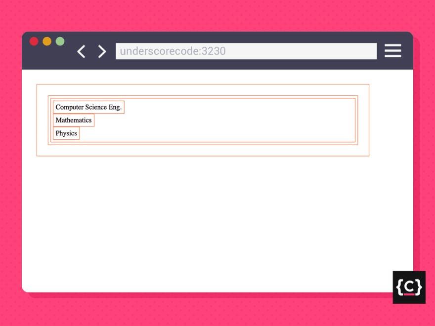
The border property shows very well the behavior of this selector. As you can observe in the image above, every element is now surrounded by a border, including the <body> element and the <html> element.
The universal selector is also used to avoid confusion and make your code easier to read.
Let’s take a look at the following examples:
div :first-child {
  background-color: maroon;
}

div:first-child {
  background-color: maroon;
}
These two code snippets look both pretty much the same, right?
Well, we only need to notice the blank space between the type selector and the pseudo-class to realize that they’re not the same: the first one selects the first child of every <div> element and the second one selects the <div> elements that are first children themselves of another element.
Don’t panic yet, we’ll be talking more in detail about pseudo-classes and how selectors work later on 🙂
For now, just keep in mind that in this example two different element selectors are working together to apply a styling rule. Everything will make sense later. Promise.
In any case, to distinguish one from the other and being able to see the blank space more clearly, we can make use of the universal selector, as shown below:
div *:first-child{
  background-color: maroon;
}
Speaking in terms of functionality, adding an asterisk symbol does nothing, but it’s useful to quickly identify the elements that are going to be targeted and to keep your code neat.
2. Type selector
Syntax: elemType { style properties }
This selector matches all elements that belong to the specified type.
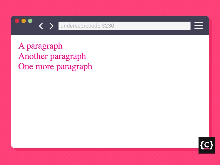
<p>A paragraph</p>
<p>Another paragraph</p>
<p>One more paragraph</p>

p {
  font-size: 1.5rem;
  color: deeppink;
}
This will apply a font size of 1.5rem and deep pink color to all <p> elements. Easy and direct.
Output:
3. Class selector
Syntax: .classname { style properties }
This selector is represented by a period (.) and matches all elements that contain the specified class.
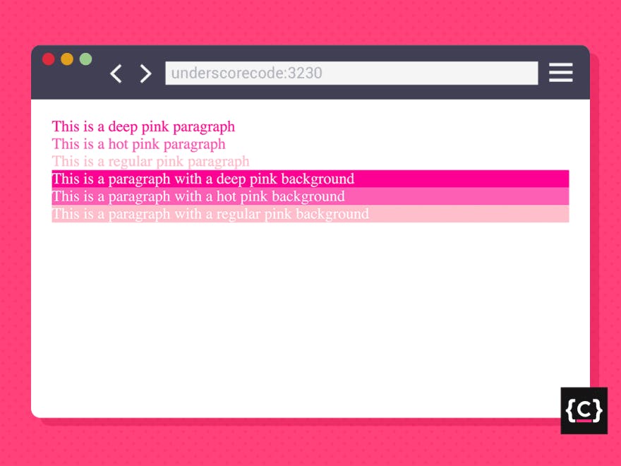
<div>
  <p class="deeppink">This is a deep pink paragraph</p>
  <p class="hotpink">This is a hot pink paragraph</p>
  <p class="pink">This is a regular pink paragraph</p>
  <p class="deeppink-bg">This is a paragraph with a deep pink background</p>
  <p class="hotpink-bg">This is a paragraph with a hot pink background</p>
  <p class="pink-bg">This is a paragraph with a regular pink background</p>
</div>

.deeppink {
  color: deeppink;
}
.hotpink {
  color: hotpink;
}
.pink {
  color: pink;
}
.deeppink-bg {
  background-color: deeppink;
}
.hotpink-bg {
  background-color: hotpink;
}
.pink-bg {
  background-color: pink;
}

/* Group selector - Stay until the end to understand its
 behavior 😉 */
.deeppink-bg, .hotpink-bg, .pink-bg {
  color: white;
}
This will apply a different pink color variant to every <p> element depending on the class they contain, styling either their text or their background.
Output:
Another way to specify a class selector is by appending the type of the element that contains the class name in front of the regular class selector.
Take a look at this example of a regular list:
<ul>
  <li class="list-item">...</li>
  <li class="list-item">...</li>
  <li class="list-item">...</li>
</ul>
We could style every list item like this:
.list-item{
  padding: 5px;
}
Or like this:
li.list-item{
  padding: 5px;
}
Note that in this specific case it wouldn’t be necessary to use this method because all the elements that contain the list-item class are <li> elements, so appending the element type wouldn't make any difference.
But let’s have a look at this other example below:
<section>
 <h1 class="big">List of animals</h1>
 <ul>
   <li><p class="big">Cat</p></li>
   <li><p class="big">Dog</p></li>
   <li><p class="big">Monkey</p></li>
   <li><p class="big">Dolphin</p></li>
   <li><p class="big">Frog</p></li>
 </ul>
</section>
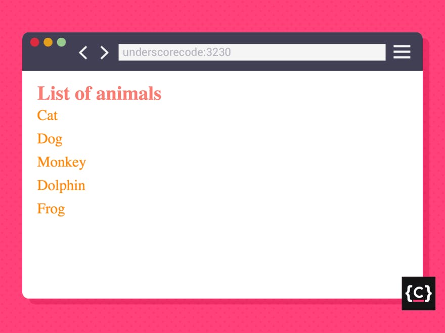
In this example, we have different types of elements referencing the same class, so, to apply different styling rules to each of them, we need to specify the type of elements that contain that class. Otherwise, the elements won’t be targeted properly and, consequently, the styles we’re trying to apply won’t be displayed as expected.
So we should do something like the following to apply different rules depending on if the element is a heading or a paragraph:
h1.big {
  font-size: 3rem;
  color: coral;
}

p.big {
  font-size: 2rem;
  color: orange;
}
Output:
4. ID selector
Syntax: #idname { style properties }
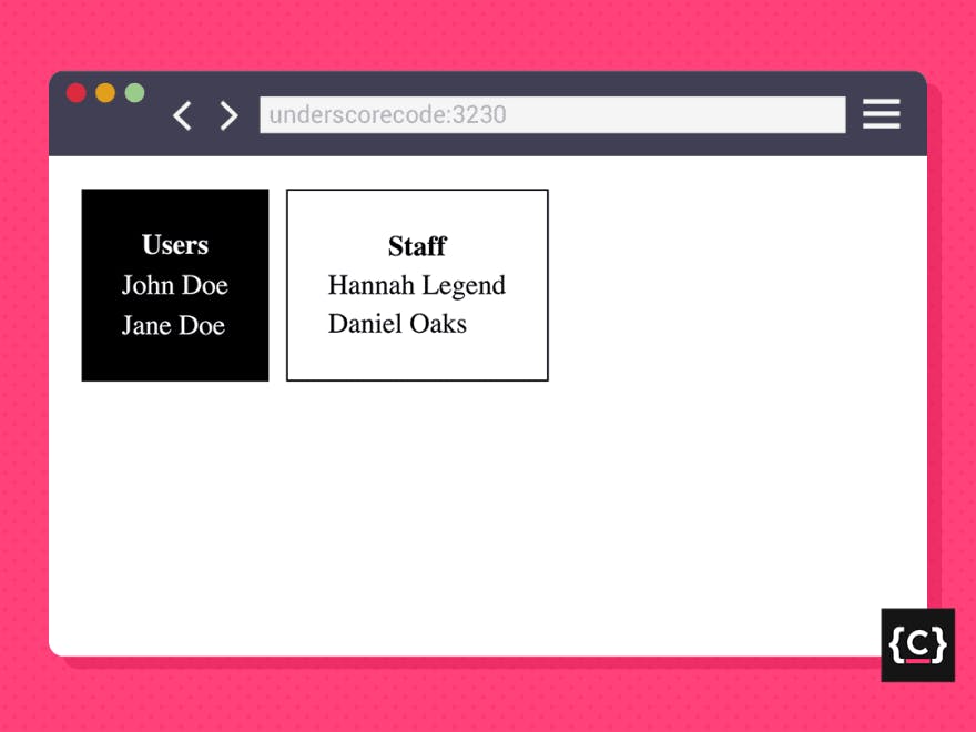
This selector is represented by a hash symbol (#) and matches the unique element that contains the specified id.
<div>
  <table id="users-table">
    <th>Users</th>
    <tr>
      <td>John Doe</td>
    </tr>
    <tr>
      <td>Jane Doe</td>
    </tr>
  </table>
  <table id="staff-table">
    <th>Staff</th>
    <tr>
      <td>Hannah Legend</td>
    </tr>
    <tr>
      <td>Daniel Oaks</td>
    </tr>
  </table>
</div>

/* Type selector */
table {
  padding: 20px;
}
/* ID selectors */
#users-table {
  background-color: black;
  color: white;
}
#staff-table {
  border: 1px solid black;
}
This will apply a black background color and a white text color to the table that matches the id users-table, and a 1px solid black border to the table that matches the id staff-table. Both of them receive padding of 20px based on their type.
Output:
*Important: Even though HTML allows you to assign the same id value to several elements, you shouldn’t ever do it. If you need to apply the same style to a bunch of different elements, always use the class attribute. You’ll keep your code clean and will get rid of a possible confusion.*
5. Attribute selector
The attribute selector is more complex than the rest of the selectors and has several syntaxes that can be applied to our HTML elements based on which condition should be satisfied by them.
In other words, it matches all the HTML elements which contain a specified attribute and whose value for that attribute satisfies a given condition.
Attribute selector syntaxes
Syntax 1
[attr] { style properties }
Matches elements with the specified attribute.
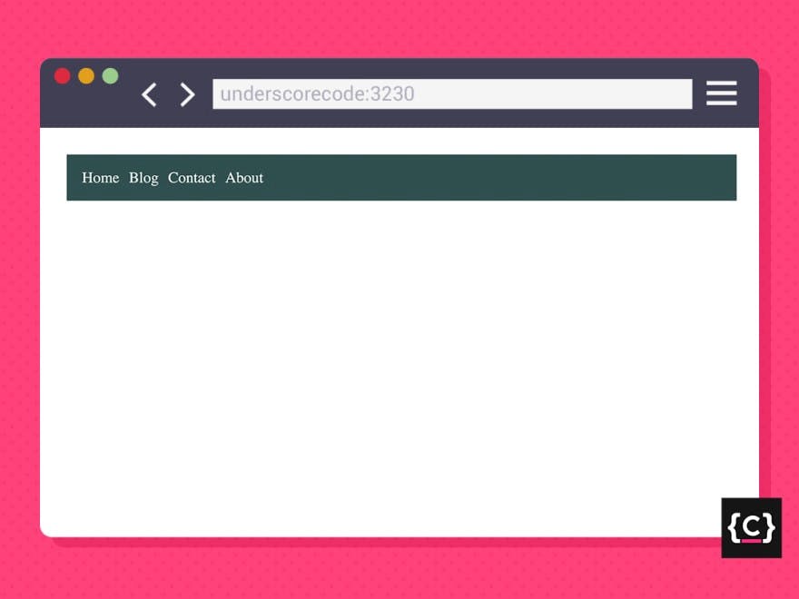
<nav>
  <ul>
    <li><a href="/">Home</a></li>
    <li><a href="/blog">Blog</a></li>
    <li><a href="/contact">Contact</a></li>
    <li><a href="/about">About</a></li>
  </ul>
</nav>

/* Type selector */
nav {
  background-color: darkslategray;
  padding: 10px;
}

/* Attribute selector */
a[href] {
  color: white;
  text-decoration: none;
}
This will apply white color to every <a> the element that contains the href attribute, regardless of its value, and removes the underline.
We’re also styling the <nav> element with a background color and some padding by making use of the type selector.
Output:
Syntax 2
[attr=value] { style properties }
Matches elements whose value for attr is the exact value.
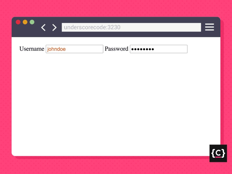
<form>
  <label for="username">Username</label>
  <input id="username" type="text" placeholder="Username" />
  <label for="password">Password</label>
  <input id="password" type="password" placeholder="Password" />
</form>

input[type="text"] {
  color: chocolate;
}
This will apply a chocolate text color to every <input> element that has the type attribute with an exact value of the text.
Output:
We could as well use this syntax to emulate the ID selector (remember the example in section 4):
[id="users-table"] {
  background-color: black;
  color: white;
}

[id="staff-table"] {
  border: 1px solid black;
}
*Explanation: By using this attribute selector syntax, we are targeting elements that contain an id attribute whose value is exactly users-table or staff-table. We’re using this one syntax because an element can only have one idname, so the value needs to be exact (=).*
Syntax 3
[attr~=value] { style properties }
Matches elements whose value for attr is a list of words separated by blanks and one of them is the exact value.
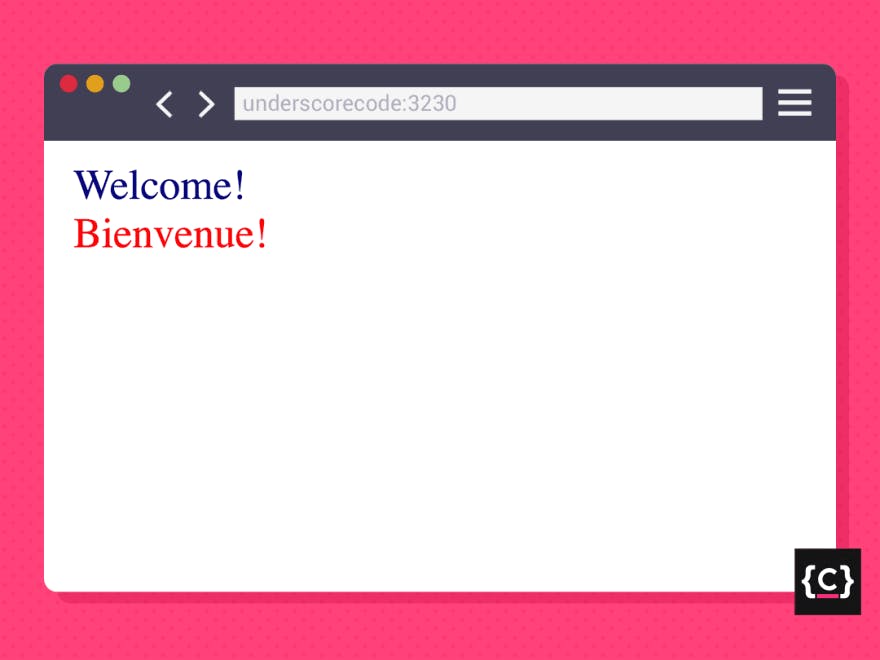
<p lang="en-gb en-us en-ca en-au en-nz">Welcome!</p>
<p lang="fr-fr fr-ca fr-be">Bienvenue!</p>

p[lang~="en-us"] {
  color: navy;
}
p[lang~="fr-fr"] {
  color: red;
}
This will apply a navy color to every <p> element whose value is a list that contains the exact string en-us. Same for all <p> elements whose value contains fr-fr, applying a red color in this case.
Output:
As well as the previous syntax, through which we could emulate the ID selector behavior, we can also use this one attribute syntax to emulate the behavior of the class selector:
[class~="list-item"]{
  padding: 5px;
}
*Explanation: By using this attribute selector syntax, we are targeting elements that have a class attribute whose value is a list that contains the string list-item. We’re using this specific syntax because an element can contain several classes and we’re aiming at just one of them (~=). But even though the element had just one class, the value for the class attribute always acts like a list of values.*
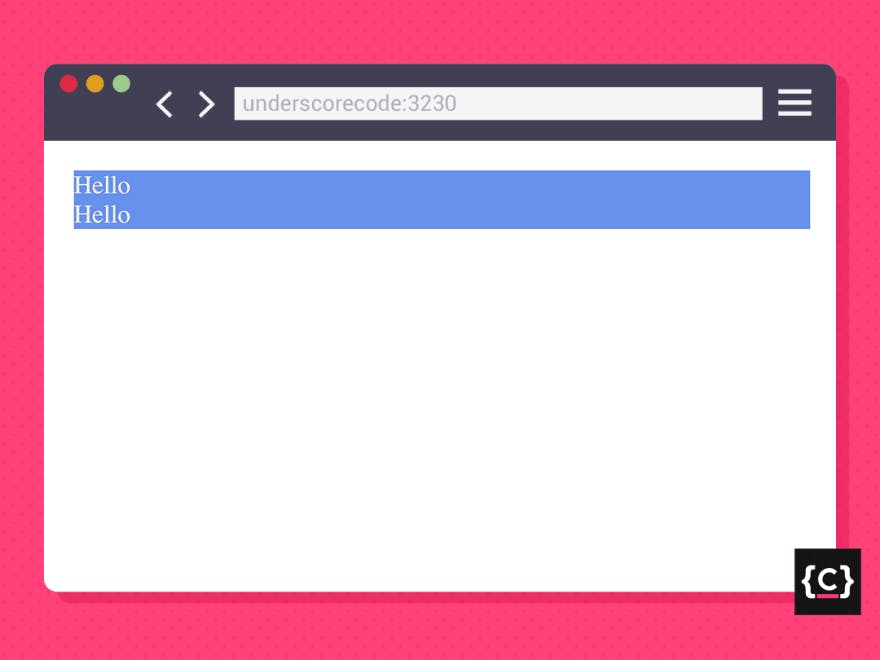
Syntax 4
[attr|=value] { style properties }
Matches elements whose value for attr is exact or starts with value followed by a hyphen.
<p lang="en-us">Hello</p>
<p lang="en-gb">Hello</p>

p[lang|="en"] {
  background-color: cornflowerblue;
  color: antiquewhite;
}
This will apply a cornflower blue background color and an antique white text color to every <p> element that has an lang attribute whose value is exactly en or starts with en-.
Output:
Syntax 5
[attr^=value] { style properties }
Matches elements whose value for attr starts with value.
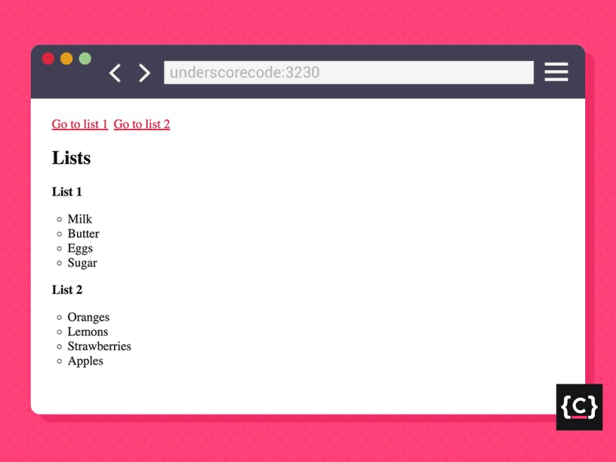
<a href="#list1">Go to list 1</a>
<a href="#list2">Go to list 2</a>
<section>
  <h1>Lists</h1>
  <div id="list1">
    <h1>List 1</h1>
    <ul>
      <li>Milk</li>
      <li>Butter</li>
      <li>Eggs</li>
      <li>Sugar</li>
    </ul>
  </div>
  <div id="list2">
    <h1>List 2</h1>
    <ul>
      <li>Oranges</li>
      <li>Lemons</li>
      <li>Strawberries</li>
      <li>Apples</li>
    </ul>
  </div>
</section>

a[href^="#"] {
  color: crimson;
  font-size: 2rem;
}
This will apply a crimson color and a font size of 2rem to every <a> element that has an href attribute whose value starts with #.
Output:
Syntax 6
[attr$=value] { style properties }
Matches elements whose value for attr ends with value.
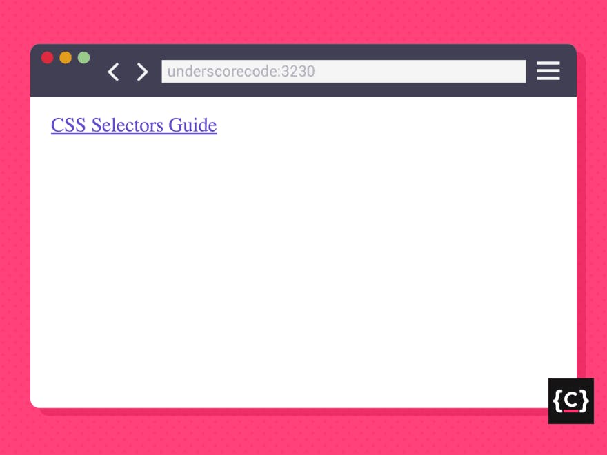
<a href="css-selectors-guide.pdf">CSS Selectors Guide</a>

a[href$=".pdf"] {
  color: slateblue;
}
This will apply a slate blue color to every <a> element that has an href attribute whose value ends with .pdf.
Output:
Syntax 7
[attr=value]* { style properties }
Matches elements whose value for attr contains at least one occurrence of value.
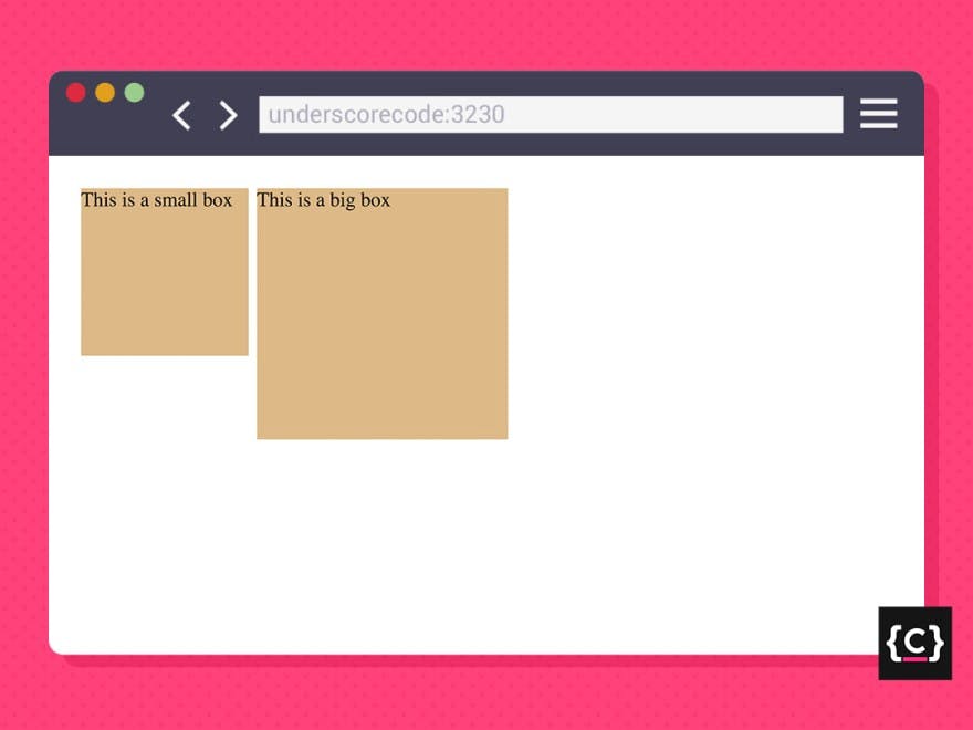
<div class="small-box">
  <p>This is a small box</p>
</div>
<div class="big-box">
  <p>This is a big box</p>
</div>

div[class*="box"] {
  background-color: burlywood;
}
This will apply a burlywood background color to every <div> element that contains an class attribute whose value has at least one occurrence of the string box.
Output:
Grouping selectors
Grouping selectors in CSS is basically used to put together those elements of different type or with different id/classes that we want to apply the same style properties too.
Additionally, by using this technique, we’ll get rid of redundancy and our code will be clean, concise, and organized.
Group selector
Syntax: elem1, …, elemN { style properties }
This selector is represented by a comma (,) and matches all the elements stated in the list, and applies the same ruleset to all of them.
<h1>Computer Science Engineering</h1>
<h2>List of courses</h2>
<ul>
  <li>Algebra</li>
  <li>Calculus</li>
  <li>Physics</li>
  <li>Discrete Mathematics</li>
  <li>Introduction to Programming</li>
</ul>

h1, h2, li {
  color: darkred;
}
This will apply a dark red color to every <h1>, <h2> and <li> element.
Output:

Combining selectors
CSS selectors can also be combined. By combining selectors, then we can define CSS combinators.
CSS combinators are used to establish a relationship between different selectors and are very useful to make your element selection more targeted.
1. Descendant combinator
Syntax: elem1 elem2 { style properties }
This combinator is represented by a single space ( ) and matches all elem2 that are descendants of elem1.
Consider the following navigation:
<nav>
  <ul>
    <li><a>Home</a></li>
    <li>
      <a>People</a>
      <ul>
        <li><a>Students</a></li>
        <li>
          <a>Faculty members</a>
          <ul>
            <a>Discrete Mathematics</a>
            <a>Programming</a>
            <a>Physics</a>
            <a>Algorithms</a>
          </ul>
        </li>
        <li><a>Staff members</a></li>
      </ul>
    </li>
    <li><a>About</a></li>
    <li><a>Contact</a></li>
  </ul>
</nav>

nav a {
  border: 1px solid crimson;
  color: darkslateblue;
  font-size: 1.5rem;
  font-weight: bold;
}
This will apply a 1px solid crimson border, a dark slate blue color, a font size of 1.5rem, and a bold font-weight to every <a> an element that is descendant of a <nav> element, regardless of how nested they are.
Output:
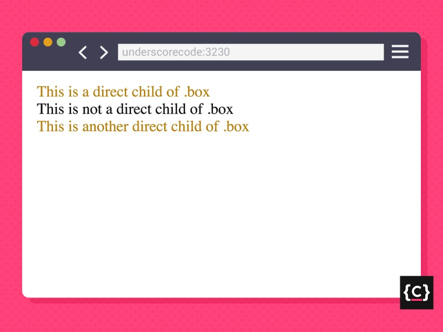
2. Child combinator
Syntax: elem1 > elem2 { style properties }
This combinator is represented by a prompt (>) and matches all elem2 that are direct children of elem1.
<div class="box">
  <p>This is a direct child of .box</p>
  <div>
    <p>This is not a direct child of .box</p>
  </div>
  <p>This is another direct child of .box</p>
</div>

.box > p {
  color: darkgoldenrod;
}
This will apply a dark golden color to every <p> element that is a direct child of any element that has the class box, so, in this HTML example, the first and last <p> elements will be selected, but not the one in the middle.
Output:
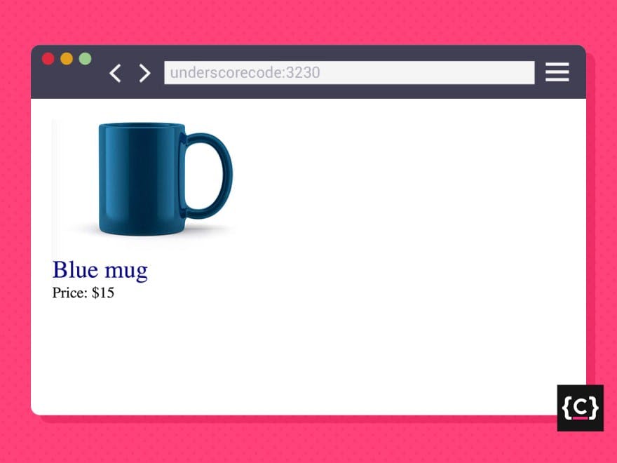
3. General sibling combinator
Syntax: elem1 ~ elem2 { style properties }
This combinator is represented by a tilde (~) and matches all elem2 that are siblings to elem1 and come after it.
<img src="blue-mug.jpeg" alt="a regular blue coffee mug" />
<p>Blue mug</p>
<p>Price: $15</p>

img ~ p {
  color: darkblue;
}
This will apply a dark blue color to every <p> element which is a sibling of any <img> element and comes after it. In this example, both <p> elements will be selected.
Output:

4. Adjacent sibling combinator
Syntax: elem1 + elem2 { style properties }
This combinator is represented by a plus symbol (+) and matches all elem2 that are siblings to elem1 and appears immediately after it.
<img src="blue-mug.jpeg" alt="a regular blue coffee mug" />
<p>Blue mug</p>
<p>Price: $15</p>

img + p {
  color: darkblue;
}
In this case, only the first <p> the element will be selected since the second one doesn't appear immediately after the <img> element.
Output:
Pseudo-classes
A CSS pseudo-class is a keyword that is added to a selector and defines a special state of the selected elements.
Syntax: Elem:pseudo-class { style properties }
This selector is represented by a colon (:).
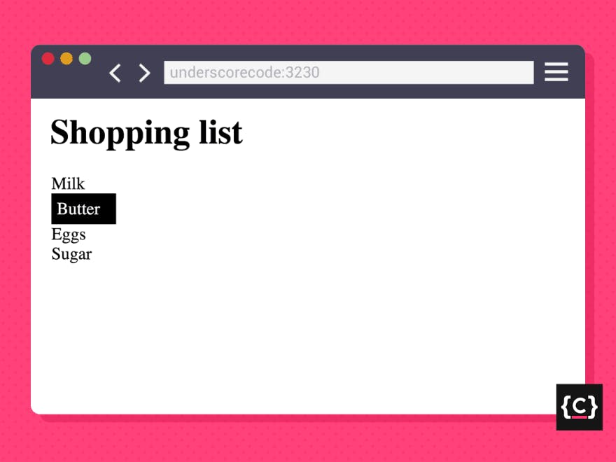
<h1>Shopping list</h1>
<ul>
  <li>Milk</li>
  <li>Butter</li>
  <li>Eggs</li>
  <li>Sugar</li>
</ul>

li:hover {
  background-color: black;
  color: white;
}
In this example, we’re applying black background color and white text color to every <li> element when the cursor hovers over it.
Take a look at what happens when we hover over the Butter element:
Output:
Some of the most common CSS pseudo-classes are:
:active, :hover, :focus, :disabled, :checked, :first-child, :nth-child, :first-of-type.
Pseudo-elements
A CSS pseudo-element is a keyword that is added to a selector to style a specific part of the selected elements.
Syntax: elem:pseudo-element { style properties }
This selector is represented by a double colon (::).
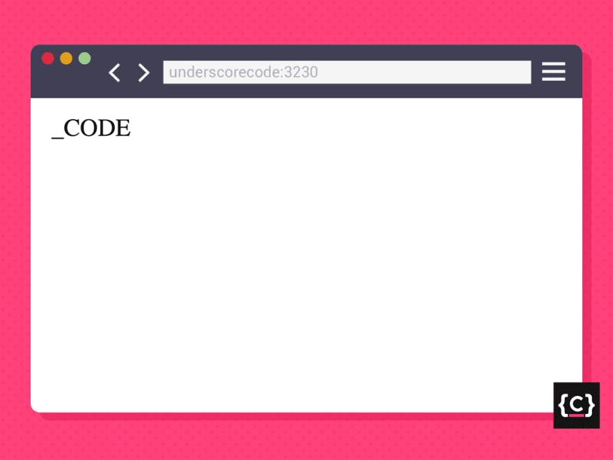
<p>CODE</p>

p::before{
  content: "_";
}
In this example, we’re appending an underscore symbol in front of every <p> element.
Output:
Some of the most common CSS pseudo-elements are:
::after (can also be written as :after), ::before (can also be written as :before), ::marker, ::placeholder, ::first-letter.
And that’s pretty much it 🙂
I hope this reference guide has been helpful for you.